If you run a hazardous facility, whether that’s a COMAH site, a chemical plant, or a mature distillery with complex utilities and high-energy processes, you already know a hard truth: most major incidents don’t come out of nowhere. They build up quietly, like pressure behind a valve that no one realises is sticking.
The problem is that the warning signs are often there… but they’re buried. Buried in maintenance backlogs, alarm floods, repeated bypasses, “temporary” repairs that become permanent, and small deviations that get normalised because “we’ve always done it this way”.
That’s exactly why process safety indicators matter. They take the foggy, messy reality of day-to-day operations and turn it into signals you can see, track, and act on.
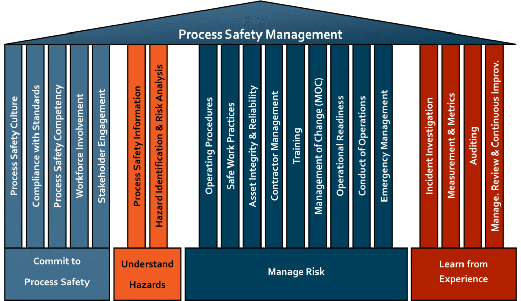
At IDEA, we regularly support hazardous facilities with Process Safety Management (PSM) system projects, including COMAH sites and distillery operations. While every site has its own threats, constraints, and culture, the systems we design share the same backbone: policy, objectives and targets, monitoring and measurement, and continual improvement.
And among monitoring and measurement sits a deceptively simple question:
“How do we know our process safety is getting better… or worse?”
Why process safety indicators matter in PSM
Think of your PSM system like the dashboard of a car. You wouldn’t drive across Scotland with no fuel gauge, no engine temperature, and no warning lights—especially in the rain, on unfamiliar roads, with a heavy load.
Yet many plants are effectively doing that with process safety. They may have policies, procedures, and risk assessments, but they’re missing the dashboard that tells them whether controls are weakening.
A strong set of process safety indicators helps you:
- Detect early deterioration in barriers and controls
- Prioritise resources (because you can’t fix everything at once)
- Demonstrate leadership commitment with visible, objective tracking
- Drive learning after events and near misses
- Create a baseline so improvement is measurable, not just “felt”
- Engage the workforce with clear focus areas and feedback loops
In short, indicators help you move from “we think we’re safe” to “we can show we’re safe, and we can prove we’re improving.”
Leading vs lagging indicators: what you should measure
One of the most common misunderstandings we see is an over-reliance on lagging indicators. These are the “after the fact” measures which are useful, but limited.
Lagging indicators: the rear-view mirror
Lagging indicators tell you what has already happened. Examples include:
- Loss of containment events (by severity and type)
- Process safety incidents and dangerous occurrences
- Fire and gas activations tied to real events
- Reportable events and enforcement actions
- High consequence near misses (where you got lucky)
Lagging indicators are important because they measure outcomes. But they’re also like checking your driving by only looking in the mirror. Helpful for context—terrible for steering.
Leading indicators: the early warning radar
Leading indicators track whether your controls and barriers are healthy today. Examples include:
- Overdue safety critical maintenance and testing
- Safety critical instrument proof test compliance
- Repeated overrides, bypasses, or inhibited alarms
- Alarm flood rates and nuisance alarm tracking
- Management of Change (MOC) compliance and quality
- Action close-out performance (HAZOP, audits, incidents)
- Permit to Work compliance checks and findings
- Training and competency completion for critical roles
- Process safety culture engagement measures (targeted, not fluffy)
Leading indicators are where you get the most prevention value—because they show you weakness before it turns into a headline.
The core elements of a good PSM system
Across high hazard industries, the strongest PSM systems tend to be built around a consistent set of pillars. At IDEA, even when we tailor systems to different sites, we keep the essentials clear:
Policy
This is your “north star”. What does leadership commit to? What does “safe operations” mean at your site?
Objectives and targets
These translate policy into practical aims—what you’re trying to improve, by when, and why.
Monitoring and measurement
This is where process safety indicators live. Without measurement, objectives drift and risks hide.
Continual improvement
A system that doesn’t learn becomes stale. Improvement means closing loops: identify gaps, act, verify, and embed.
It’s not complicated in theory. The challenge is doing it in the real world, with real constraints, and real people.
The “one size doesn’t fit all” reality in hazardous facilities
Here’s the honest truth: copying another company’s indicator set rarely works.
Why? Because your plant is not their plant. Your equipment, utilities, operating profile, age of assets, workforce experience, and management structure are different. Even two distilleries can have wildly different risk profiles depending on:
- Spirit handling systems and storage arrangements
- Ventilation and hazardous area zoning decisions
- Heating utilities and steam distribution condition
- CIP configurations and chemical storage
- Space constraints and access limitations
- How projects are executed (capex intensity, contractor management, etc.)
Good practice from other industries is valuable—especially from sectors like chemicals, oil and gas, and pharma—but it still needs translating into fit-for-purpose indicators for your operation.
That’s where experience matters: knowing what “good” looks like, and adapting it without creating a bureaucratic monster.
Embedding PSM early: better outcomes, less rework
If you only bring PSM in at the end of a project, you’re asking for rework. It’s like installing the brakes after the car is built.
Embedding PSM at the start of a project helps you:
- Define operating and safety intent early
- Align design decisions with barrier management
- Set up data capture from day one (so you don’t start blind)
- Build procedures, competency, and assurance into the delivery plan
- Avoid costly retrofits when compliance gaps appear late
And importantly, it allows the PSM system to evolve with the operation, rather than being bolted on as a separate “safety thing”.
The hidden risk: lack of historical data and trend insight
When we’re invited to support mature sites, one theme comes up again and again:
There isn’t enough usable historical data—or it exists, but no one has analysed it.
Sometimes it’s because data sits in different places: CMMS, shift logs, PTW records, alarm systems, inspection reports, spreadsheets, emails… you name it. Sometimes it’s because the site is busy, and trending feels like a luxury.
But without trend insight, you miss the slow creep:
- Backlogs rising month by month
- Repeat failures on the same protective device
- Increasing frequency of safety critical overrides
- Poor quality MOCs slipping through
- Audit actions repeatedly overdue
- Increasing process deviations accepted as “normal”
Data analysis becomes an essential early warning system. Not to blame people—just to see risk clearly and prioritise what matters.
HSG 254 and the 6-step guide to performance measurement
If you want a solid, practical starting point, HSE guidance HSG 254: Developing Process Safety Indicators is widely recognised for good reason. It frames indicators as part of a structured improvement loop, not a tick-box list.
In simple terms, the approach guides you to:
- Decide what you need to measure (based on hazards and controls)
- Select indicators that reflect those controls and risks
- Define data collection and responsibilities
- Set targets and thresholds (what “good” and “bad” look like)
- Report and review results at the right levels
- Act and learn—improve the system based on the signals
The magic isn’t in the document. The magic is in using a structured approach so indicators actually drive decisions.
Building a robust suite of indicators: what “good” looks like
A robust indicator suite is not “more metrics”. It’s the right metrics, owned by the right people, reviewed at the right frequency, and linked to action.
Pick indicators that connect to barriers
Start with your major accident hazards and identify the key barriers:
- Prevention barriers (stop the event)
- Protection/mitigation barriers (reduce consequences)
Then choose indicators that show whether those barriers are healthy.
For example:
- If overpressure protection is critical, track proof test compliance and defect closure for PSV inspections.
- If containment is critical, track corrosion/inspection anomalies and repair overdue rates.
- If control system layers are critical, track bypass frequency and duration.
Avoid vanity metrics
A metric that looks good but doesn’t change decisions is just noise. If you can’t answer “what would we do differently if this number moves?”, it’s probably not worth tracking.
Balance site-level and asset-level indicators
You need both:
- Site-wide signals (backlogs, MOC health, audit closure)
- Risk-based asset signals (safety critical test compliance, repeated failures, barrier impairments)
Define clear thresholds
Don’t just report a number—define what it means.
- Green: acceptable
- Amber: attention needed
- Red: immediate action / escalation
This turns reporting into decision-making, not passive observation.
Turning data into an early warning system
Indicators only become an early warning system when you build the loop around them.
Here’s what that loop looks like in practice:
- Data captured consistently
- Trends reviewed routinely (not annually)
- Exceptions escalated with clear triggers
- Actions assigned with owners and deadlines
- Learning shared and embedded
- Follow-up verifies the fix actually worked
And crucially: leadership uses the data to remove obstacles. Because if a team is drowning in backlog and the response is “try harder,” the system will quietly fail.
Workforce engagement: the make-or-break ingredient
You can design the best indicator suite in the world and still get nowhere if the workforce doesn’t believe in it.
A workforce that is confident leadership supports PSM will usually do the right thing—even when it’s inconvenient.
So how do you build that confidence?
- Be transparent: share trends, not just successes
- Close the loop: show what changed because people raised issues
- Make reporting safe: encourage learning, not blame
- Keep it practical: avoid metrics that feel like paperwork
- Go and see: leaders should spend time where the risk lives
If indicators are seen as “management numbers,” engagement drops. If indicators are seen as “our early warning system,” people lean in.
How IDEA supports clients: from baseline to continual improvement
When IDEA supports PSM system projects for distilleries, COMAH sites, and hazardous facilities, we focus on making the system fit for your operation, not a generic template.
Typical support includes:
- Reviewing existing PSM elements against good practice
- Identifying major accident hazards and critical barriers
- Defining an indicator framework aligned to those barriers
- Establishing baseline data capture and reporting routes
- Designing dashboards and governance reviews (site, leadership, board)
- Setting practical targets, thresholds, and escalation triggers
- Improving data quality and analysis methods
- Embedding continual improvement loops and learning processes
In other words: we help you go from “we should measure process safety” to “we measure it, we understand it, and we act on it.”
Getting started: practical next steps for your site
If you’re thinking, “Right, where do we begin?”
Here’s a practical pathway:
- Confirm your major accident hazards and key barriers
- Choose a small number of high-value leading indicators (start with 6–12)
- Add a few lagging indicators for outcome tracking and learning
- Define owners, data sources, and review frequency
- Set thresholds and escalation rules
- Run a short pilot (8–12 weeks) and refine
- Roll out, report, and improve
Like any good system, it evolves. The goal isn’t perfection on day one. The goal is momentum with quality.
Conclusion
Process safety indicators are not about creating more spreadsheets. They’re about building a clear, reliable early warning system that highlights weaknesses in your controls before those weaknesses become incidents. For hazardous facilities and COMAH sites, that visibility is priceless because the cost of being wrong is simply too high.
When indicators are aligned to major accident hazards, balanced between leading and lagging measures, and embedded into a PSM system built on policy, objectives, monitoring, and continual improvement, they become more than numbers. They become a shared language for leadership and the workforce to keep the site safe, resilient, and operationally strong.
And when people trust that leadership genuinely supports PSM, they don’t just comply, they contribute. That’s where real safety performance comes from.
FAQs
1) What is the difference between process safety indicators and occupational safety indicators?
Occupational safety indicators typically focus on personal injury events (slips, trips, falls), while process safety indicators focus on preventing major accident hazards like fires, explosions, toxic releases, and loss of containment.
2) How many process safety indicators should a site track?
It depends on complexity, but many sites start with 6–12 high-value leading indicators plus a smaller set of lagging indicators. Start lean, prove value, then expand carefully.
3) Are leading indicators always better than lagging indicators?
Not better, different. Leading indicators help prevent incidents by monitoring barrier health. Lagging indicators help you learn from outcomes. You need both, with a strong bias toward leading indicators for prevention.
4) What makes a “good” process safety indicator?
A good indicator is linked to key hazards/barriers, uses reliable data, has clear thresholds, is owned by someone accountable, is reviewed routinely, and triggers meaningful action when it changes.
5) Why do process safety indicator programmes fail?
Common reasons include poor data quality, too many metrics, unclear ownership, lack of leadership follow-through, weak action management, and low workforce trust. Indicators must drive decisions, not just reporting.